Landing Pages Introduction
A landing page is like a digital storefront. It’s designed to welcome visitors and lead them to take a specific action, like signing up for a newsletter or buying a product.
It’s the first page potential customers land on after clicking a link in an email, an ad from Google, a YouTube video, or similar places on the web.
Landing page is focused on one thing: getting potential customers to take action.
It’s like a friendly guide who takes their hand and shows them exactly where to go and what to do. This could mean filling out a form, grabbing a freebie, or becoming a customer.
The idea is to make this process as easy and appealing as possible, so they feel like it’s the natural next step.
In the world of marketing, landing pages are superstars. They’re tailor-made to capture the interest of potential customers or “leads”.
Whether you’re a small business owner, a blogger, or part of a big marketing team, understanding how to whip up a great landing page is like having a secret weapon.
It’s about making sure every element, from headlines to images and call-to-action buttons, works together. To create a journey that feels personal and irresistible to the visitor.
The Fundamentals of Landing Pages
A landing page is like your online elevator pitch – short, sharp, and persuasive. It’s all about focusing on one thing: getting your visitor to take action. Unlike a homepage that’s a hub of different information, a landing page hones in on a single goal, like getting visitors to sign up, download, or buy.
The secret sauce of a successful landing page includes a catchy headline that hooks interest, clear and concise. The content is properly explaining your offer. And engaging visuals or videos to keep the visitor’s attention.
It’s straightforward, easy to navigate, and speaks directly to the visitor’s needs.
Why are landing pages crucial for your business?
They’re conversion powerhouses. When someone clicks on your ad or a link, they’re already interested.
A landing page takes this interest and turns it into action.
The Role of Landing Page Optimisation
Think of it like tuning a musical instrument. A finely tuned guitar produces the perfect melody. A well-optimised landing page hits the right notes with your audience, leading them to the action you desire.
So, what exactly is landing page optimization? It’s the process of making adjustments and improvements to your landing page to increase its effectiveness.
This isn’t just about making it look pretty. It’s about ensuring every element – from the headline and images to the layout and call-to-action – works together. So seamlessly to create an irresistible and user-friendly experience.
When your landing page is optimised, visitors don’t just land; they engage, interact, and take the actions that matter most to your business.
Landing Page Best Practices
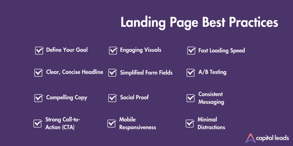
Define Your Goal
Start by setting specific and measurable goals for your landing page. Rather than vague ambitions like “increase awareness,” pinpoint what success looks like in quantifiable terms.
For example, your goal might be to “get 200 sign-ups per month” or “generate 150 leads for product demos.” Such clarity in objectives directly affect the overall design and content strategy of your landing page.
It’s essential to align every element on your landing page with your primary goal. If the aim is lead generation, the page design and content should be designed towards persuading visitors to submit their contact details.
This focus might be prioritising a sign-up form and developing content. This needs to articulate the unique benefits of your product or service. And then choose visuals that appeal to your target audience.
Clear, Concise Headline
A headline is the first thing visitors see on your landing page, acting as a crucial hook that captures their attention and sets the tone for their experience.
It’s not just about grabbing attention; it’s about conveying your offering in a straightforward yet compelling way.
For instance, “Transform Your Home with Efficient Solar Power” instantly communicates the idea of home improvement through sustainable energy, appealing directly to eco-conscious homeowners.
This is where conciseness plays a vital role. A lengthy, complicated headline can lose your audience before they even start.
Instead, your headline should be a crisp elevator pitch, something like “Experience Year-Round Comfort with Eco-Friendly Heat Pumps.”
This statement is direct and highlights key benefits – comfort and eco-friendliness – which align with the priorities of modern consumers.
Effective headlines go beyond merely stating what the product or service is; they evoke emotion, offer a solution, or present a clear benefit.
An impactful headline not only draws visitors in but also sets them on a journey through your landing page content. This will ultimately guiding them towards taking action.
Compelling Copy
The text on your landing page is much more than just information. It’s the persuasive voice that guides your visitors towards taking action.
It’s essential that this copy is easy to digest and convincingly presents your product or service. When dealing with products like solar panels, your copy should clearly highlight the key benefits.
For example, products like heat pumps, the copy should focus on their unique selling propositions.
Emphasise the efficiency of heat pumps, which translates to cost savings for the consumer.
Highlight their dual functionality, providing both heating and cooling solutions. Making them a versatile choice for year-round comfort.
By clearly articulating these benefits, your copy speaks directly to the needs and desires of potential customers. Presenting your product as a solution to their specific problems or aspirations.
Remember, the goal of your landing page copy is to connect with your audience and convince them of the value of your offer.
Use language that is simple yet powerful, avoiding jargon that might confuse or alienate potential customers.
Your copy should be a seamless blend of informative and persuasive elements. It should be leading the visitor to understand not just what you are offering, but why it matters to them.
Strong Call-to-Action (CTA)
The Call-to-Action (CTA) is arguably the most critical component of your landing page. It’s the tipping point between browsing and action, guiding visitors towards a clear objective. A compelling CTA should be unmistakable and action-oriented, pushing visitors towards a decision.
For example, using a CTA like “Get Your Free Solar Quote Today” for solar panels, not only urges immediate action but also clarifies what the visitor stands to gain – a free quote on a potentially life-altering service.
A strong CTA should stand out visually on the page. Whether through contrasting colours, a distinctive button design, or its placement on the page, it should catch the eye of the visitor.
This visual prominence ensures that once a visitor is convinced of the value proposition, the next step – taking action – is crystal clear.
Engaging Visuals
Visuals play a vital role in capturing and maintaining the interest of visitors on your landing page.
Include images or videos that showcase your products in action. This not only adds aesthetic appeal but also helps in building credibility and trust.
High-quality images of solar panels installed on a variety of homes show versatility and practicality.
The visuals of a landing page serve a dual purpose. First, they are informative, explaining how the product works and its benefits. Second, they’re persuasive, showcasing the product in an appealing and professional manner.
It’s important to ensure that these visuals are of high quality and relevant to your target audience.
The visuals should complement your text, not overpower it, creating a balanced and harmonious page layout.
A well-placed and engaging visual can break up dense text, provide a clearer understanding of your product, and ultimately, make your landing page more compelling.
Simplified Form Fields
The effectiveness of a landing page is often determined by the simplicity and intuitiveness of its forms.
This approach involves minimising the number of form fields and requesting only essential information.
Typically, this means sticking to basics like name, contact details, and location, particularly if a custom quote is part of your offering.
A simplified form can enhance the overall user experience on your landing page. When a potential customer has a smooth experience from the start, they’re more likely to view your brand positively.
By asking only for necessary information, you strike a balance between gathering valuable leads and respecting the user’s time and effort. This ultimately leads to a more effective lead generation process.
Social Proof
Social proof is a powerful tool in establishing trust and credibility on your landing page.
Consider showcasing a variety of testimonials that speak to different aspects of your product. Incorporate ratings and reviews to add another layer of authenticity.
People often rely on peer opinions when making purchase decisions. And seeing high ratings can significantly influence their confidence in your product.
You might also consider including case studies or before-and-after scenarios, especially for more technical products.
These detailed accounts can help potential customers visualise the process and outcome, further encouraging them to consider your product.
Adding social proof to your landing page can be a game-changer. It not only enhances your product’s credibility but also builds a sense of community and trust around your brand.
Mobile Responsiveness
Yes, mobile responsiveness is not just an added feature; it’s a necessity for any successful landing page.
With an ever-increasing number of users accessing websites through smartphones, make sure your landing page displays well and functions smoothly on mobile devices.
To optimise for mobile responsiveness, every element of your landing page needs to be tested and tailored for mobile user experience.
This includes simplifying the layout, text is readable without zooming. Images or videos automatically resize to fit smaller screens.
The loading speed also super important. Mobile users often have less patience for slow-loading pages. Any delay of even a few seconds can lead to potential customers abandoning your page.
Interactive elements like forms and call-to-action buttons must be easy to navigate using a touchscreen.
Forms should be concise, as typing on mobile can be more cumbersome, and buttons must be prominently displayed and easily tappable.
Videos should be optimised for mobile viewing. In term of file size and playability, to ensure they are accessible to users on various devices and internet speeds.
By prioritising mobile responsiveness, you’re enhancing the overall user experience.
This attention to detail signals to potential customers that you value their time and convenience. That can be a deciding factor in their journey from being interested visitors to becoming actual customers.
A well-optimised mobile landing page ensures that you are reaching your audience effectively.
Fast Loading Speed
In the fast-paced digital world, the loading speed of your landing page is a critical factor in keeping potential customers engaged.
A page that loads slowly risks losing visitors, as modern internet users generally have a low tolerance for waiting.
To optimise your landing page for fast loading, start by focusing on image sizes. High-resolution images can significantly slow down page loading times.
Consider compressing these images or using formats like JPEG or WebP, which provide good quality at smaller file sizes.
You want your images to be light enough for quick loading but clear enough to effectively showcase your products.
Another aspect is the technical optimization of your landing page. This includes minimising the use of large, complex scripts and CSS files that can bog down loading times.
Using techniques like lazy loading, where certain elements of the page are loaded only when needed, can also enhance speed.
Make sure your web hosting service is reliable and capable of handling the traffic your page will receive. Remember, server response time can also affect loading speed.
By ensuring your landing page loads quickly, you significantly increase the chances of visitors staying engaged and receiving your message or offer.
A smooth, fast experience demonstrates professionalism and respect for the visitor’s time, contributing positively to their overall perception of your brand.
A/B Testing
A/B testing is a crucial strategy for fine-tuning your landing page, especially when your goal is to maximise lead generation.
This approach involves creating two different versions of your page (Version A and Version B.
And testing them against each other to see which performs better.
For example, you might experiment with different headlines to see which one connects more with your audience.
A headline like “Cut Energy Costs with Solar Power” might appeal more to those concerned about savings. While “Go Green with Solar Energy” could resonate better with an environmentally conscious demographic.
Testing these variations helps you understand what motivates your visitors and how they respond to different messages.
But it’s not just the headlines you can test. Other elements like call-to-action (CTA) buttons, images, form designs, and even the layout of the page can be subjects of A/B testing.
For instance, you might find that a button saying “Get a Free Quote” leads to more conversions than one saying “Learn More.”
Beside that, testing different images or video content can reveal what types of visuals are most appealing to your visitors.
The key to effective A/B testing is to change one element at a time. This way, you can accurately attribute any differences in performance to that specific change.
Regularly conducting these tests and analysing the results can lead to continuous improvements in your landing page’s effectiveness. Leading to more conversions and a successful lead generation campaign.
Consistent Messaging
Consistent messaging between your ads and landing page is vital in creating a seamless and effective user experience.
When a potential customer clicks on an ad, they expect to find a landing page that directly reflects the message or offer presented in the ad.
This continuity is crucial in building trust and guiding the visitor towards a conversion.
For example, if your ad highlights “Reduce Your Carbon Footprint with Solar Energy,” your landing page should immediately reinforce this message.
The headline, imagery, and text should all echo the theme of reducing carbon footprints through solar energy.
This reassures visitors that they’ve come to the right place and keeps them engaged with a consistent narrative.
The concept of consistent messaging extends beyond just the headline or main text. Every element of your landing page should align with the initial promise or message of your ad.
This alignment helps in maintaining the visitor’s interest and reinforces the credibility of your offer.
Moreover, consistent messaging aids in building a cohesive brand identity. When all elements of your marketing strategy speak the same language, it creates a strong, recognizable brand presence.
Minimal Distractions
When designing a landing page, one key principle is to keep the visitor’s focus squarely on the intended message and action.
Eliminating potential distractions plays a critical role in this. This means removing elements like navigation menus, unrelated links, or excessive information. Everything that might lead the visitor away from the main objective of the page.
Navigation menus, while useful on a main website, can be counterproductive on a landing page.
Links that lead to external sites or even other pages of your own website can divert attention. This will reduce the chances of converting a visitor into a lead.
The design of the landing page should be focused and straightforward. It should guide the visitor’s attention to the key elements: the offer, the benefits, and the call-to-action (CTA).
Any additional elements on the page should support and reinforce this pathway, not deviate from it.
By minimising distractions, you ensure the visitor’s attention is exactly where you want it.
This focused approach not only enhances the effectiveness of your landing page. But also respects the visitor’s time, making it easier for them to understand and engage with your offer.
Ultimately, a landing page with a clear, undistracted path is more likely to succeed in converting visitors into customers.
Landing Page Metrics to Track
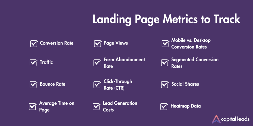
Tracking the right metrics is crucial for understanding the performance of your landing page and making informed decisions for improvements. Here are key landing page metrics to keep an eye on:
Conversion Rate
The percentage of visitors who complete the desired action (e.g., filling out a form, making a purchase). It’s the most direct indicator of your landing page’s effectiveness.
Traffic
The total number of visitors to your landing page. It helps gauge the overall reach and interest in your page.
Bounce Rate
The percentage of visitors who leave your site after viewing only the landing page. A high bounce rate could indicate that your page isn’t engaging enough or relevant to your audience.
Average Time on Page
This metric shows how long visitors are staying on your landing page. Longer times can indicate more engagement with your content.
Page Views
The total number of views your landing page receives. This differs from ‘traffic’ as one visitor can view the page multiple times.
Form Abandonment Rate
If your landing page has a form, this metric indicates the percentage of visitors who start filling out the form but don’t complete it. A high abandonment rate may suggest that your form is too long or confusing.
Click-Through Rate (CTR)
For pages with links or calls to action, this is the percentage of visitors who click on them. It helps assess the effectiveness of your CTAs.
Lead Generation Costs
The cost of acquiring a lead through your landing page. This is crucial for understanding the ROI of your landing page and marketing efforts.
Mobile vs. Desktop Conversion Rates
Compare the effectiveness of your landing page across different devices. It’s essential in optimising your page for mobile users.
Segmented Conversion Rates
Analysing conversion rates based on different traffic sources (e.g., social media, email marketing, organic search) to understand which channels are most effective.
Social Shares
The number of times your landing page has been shared on social media. It indicates the level of engagement and the page’s reach.
Heatmap Data
Shows where users are clicking, moving, and scrolling on your page. Providing insights into user behaviour and what elements are attracting the most attention.
By regularly monitoring these metrics, you can gain valuable insights into how your landing page is performing. And where there may be opportunities for optimization and improvement.
Conclusion
Optimising your landing page is a vital step towards skyrocketing your lead generation. Remember, a well-crafted landing page can be the powerhouse for converting visitors into valuable leads.
At Capital Leads, we excel in this arena, offering quality, data-validated leads using a sophisticated multi-platform approach. We don’t just understand lead generation; we redefine it for large growth companies.
Ready to transform your landing page into a lead-generating machine? Visit us at Capital Leads to learn more, or jumpstart your journey to success by getting started now.
Let’s unlock your company’s full potential together!
Let’s unlock your company’s full potential together!


